Bootstrap 5 Alerts
-
بنتعرف في هذا الدرس كيف بنستخدم Alerts في Bootstrap 5 حيث يوفر طريقة سهلة لإنشاء رسائل التنبيه عن طريق مجموعه معرفه مسباق من classes وهذه classes هي :
.alert-success, .alert-info, .alert-warning, .alert-danger, .alert-primary, .alert-secondary, .alert-light or .alert-dark:
نطبق مثال على جميع هذه classes حتى نفهم شو يعني:
<!DOCTYPE html>
<html lang="en">
<head>
<title>Bootstrap Example</title>
<meta charset="utf-8">
<meta name="viewport" content="width=device-width, initial-scale=1">
<link href="https://cdn.jsdelivr.net/npm/[email protected]/dist/css/bootstrap.min.css" rel="stylesheet">
<script src="https://cdn.jsdelivr.net/npm/[email protected]/dist/js/bootstrap.bundle.min.js"></script>
</head>
<body>
<div class="container mt-3">
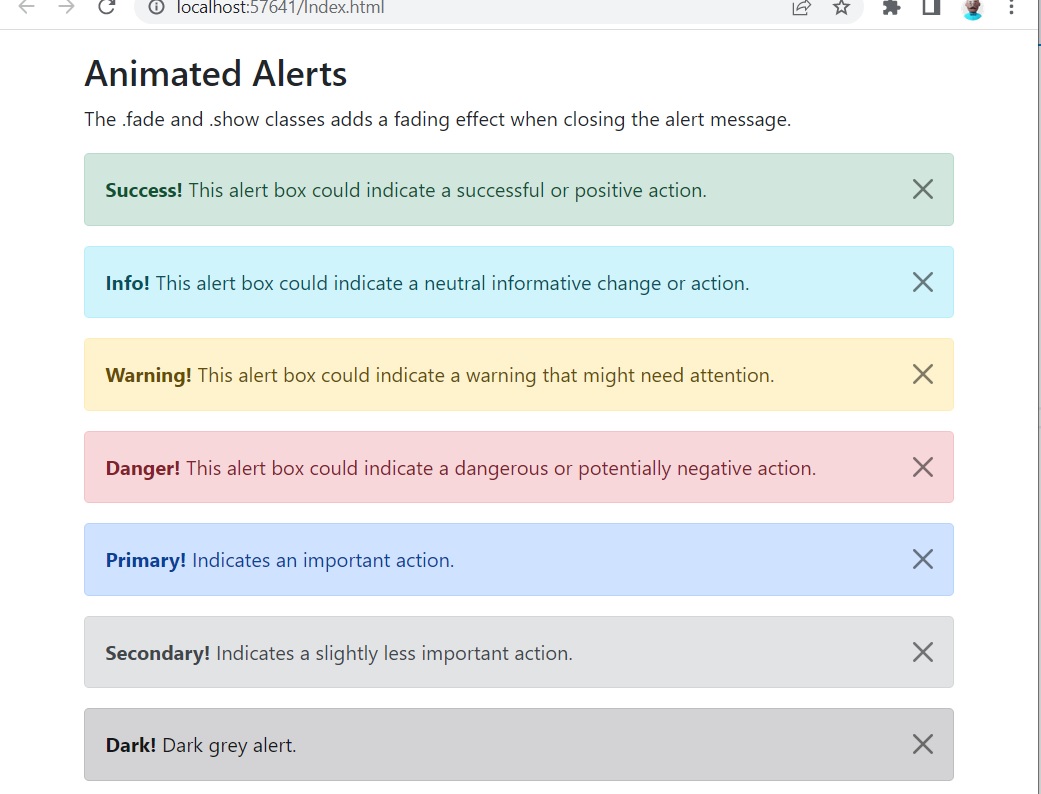
<h2>Animated Alerts</h2>
<p>The .fade and .show classes adds a fading effect when closing the alert message.</p>
<div class="alert alert-success alert-dismissible fade show">
<button type="button" class="btn-close" data-bs-dismiss="alert"></button>
<strong>Success!</strong> This alert box could indicate a successful or positive action.
</div>
<div class="alert alert-info alert-dismissible fade show">
<button type="button" class="btn-close" data-bs-dismiss="alert"></button>
<strong>Info!</strong> This alert box could indicate a neutral informative change or action.
</div>
<div class="alert alert-warning alert-dismissible fade show">
<button type="button" class="btn-close" data-bs-dismiss="alert"></button>
<strong>Warning!</strong> This alert box could indicate a warning that might need attention.
</div>
<div class="alert alert-danger alert-dismissible fade show">
<button type="button" class="btn-close" data-bs-dismiss="alert"></button>
<strong>Danger!</strong> This alert box could indicate a dangerous or potentially negative action.
</div>
<div class="alert alert-primary alert-dismissible fade show">
<button type="button" class="btn-close" data-bs-dismiss="alert"></button>
<strong>Primary!</strong> Indicates an important action.
</div>
<div class="alert alert-secondary alert-dismissible fade show">
<button type="button" class="btn-close" data-bs-dismiss="alert"></button>
<strong>Secondary!</strong> Indicates a slightly less important action.
</div>
<div class="alert alert-dark alert-dismissible fade show">
<button type="button" class="btn-close" data-bs-dismiss="alert"></button>
<strong>Dark!</strong> Dark grey alert.
</div>
<div class="alert alert-light alert-dismissible fade show">
<button type="button" class="btn-close" data-bs-dismiss="alert"></button>
<strong>Light!</strong> Light grey alert.
</div>
</div>
</body>
</html>
نتيجة التنفيذ بتكون :
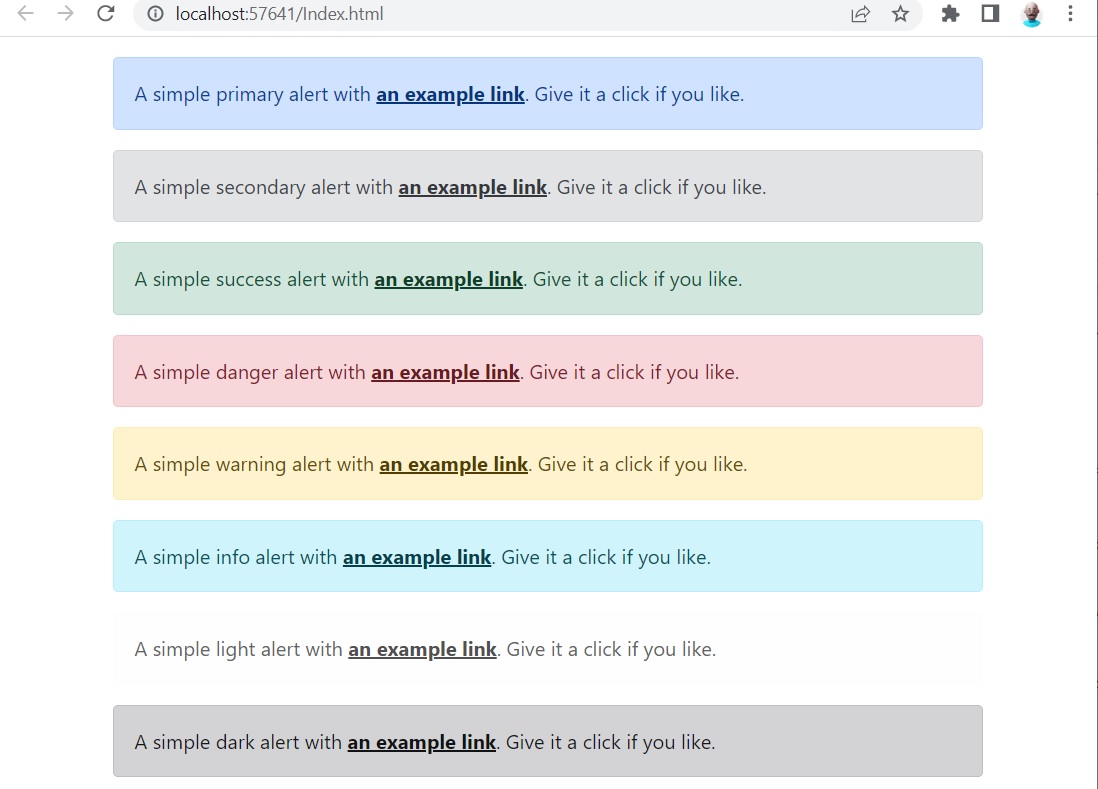
Link color
استخدم alert-link باسم utility class. لتوفير روابط ملونة مطابقة بسرعة داخل أي alert وبشكل تلقائي يتم تنسق اللون مع Alert.
نطبق المثال التالي حتى نفهم هذا الكلام:
<!DOCTYPE html>
<html lang="en">
<head>
    <title>Bootstrap Example</title>
    <meta charset="utf-8">
    <meta name="viewport" content="width=device-width, initial-scale=1">
    <link href="https://cdn.jsdelivr.net/npm/[email protected]/dist/css/bootstrap.min.css" rel="stylesheet">
    <script src="https://cdn.jsdelivr.net/npm/[email protected]/dist/js/bootstrap.bundle.min.js"></script>
</head>
<body>
    <div class="container mt-3">
        <div class="alert alert-primary" role="alert">
            A simple primary alert with <a href="#" class="alert-link">an example link</a>. Give it a click if you like.
        </div>
        <div class="alert alert-secondary" role="alert">
            A simple secondary alert with <a href="#" class="alert-link">an example link</a>. Give it a click if you like.
        </div>
        <div class="alert alert-success" role="alert">
            A simple success alert with <a href="#" class="alert-link">an example link</a>. Give it a click if you like.
        </div>
        <div class="alert alert-danger" role="alert">
            A simple danger alert with <a href="#" class="alert-link">an example link</a>. Give it a click if you like.
        </div>
        <div class="alert alert-warning" role="alert">
            A simple warning alert with <a href="#" class="alert-link">an example link</a>. Give it a click if you like.
        </div>
        <div class="alert alert-info" role="alert">
            A simple info alert with <a href="#" class="alert-link">an example link</a>. Give it a click if you like.
        </div>
        <div class="alert alert-light" role="alert">
            A simple light alert with <a href="#" class="alert-link">an example link</a>. Give it a click if you like.
        </div>
        <div class="alert alert-dark" role="alert">
            A simple dark alert with <a href="#" class="alert-link">an example link</a>. Give it a click if you like.
        </div>
    </div>
</body>
</html>
النتيجة بتكون:


اترك تعليقك